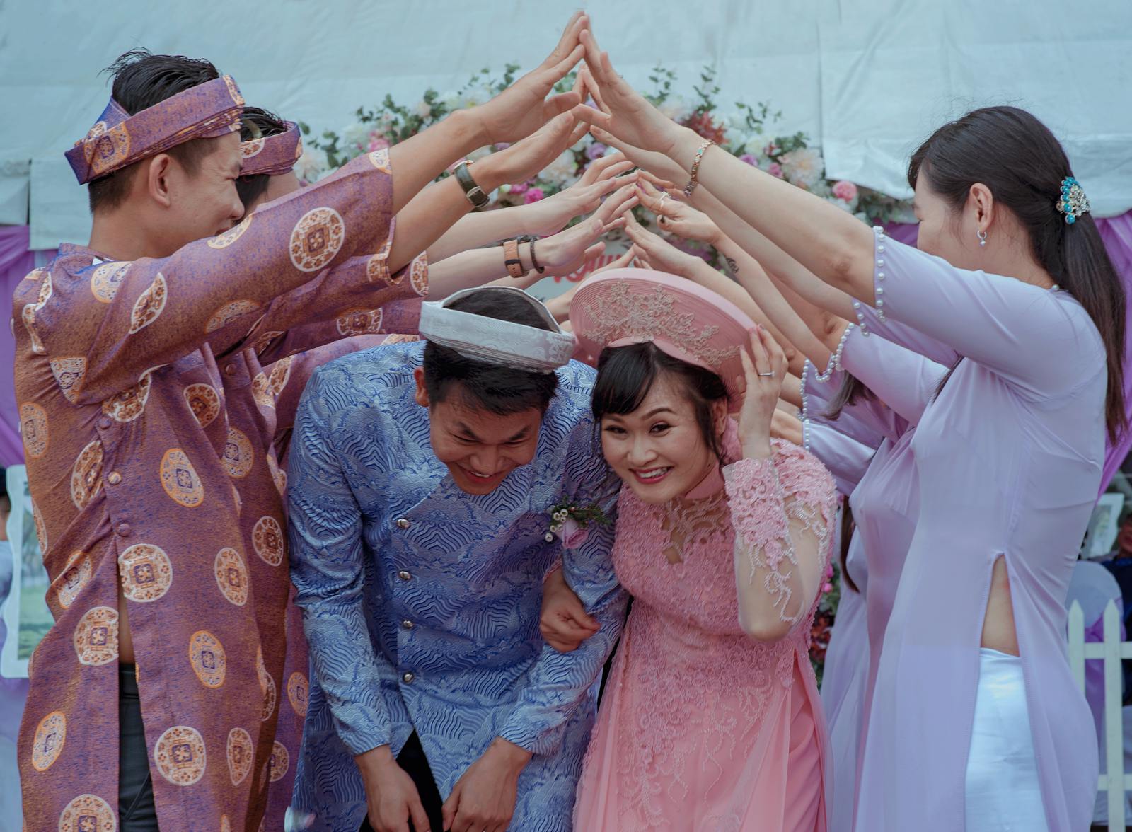
Choosing a timeless wedding color scheme is crucial for creating a cohesive and elegant aesthetic for your special day. When selecting your colors, consider classic palettes that have stood the test of time, such as soft pastels, neutral tones, or timeless combinations like black and white. These classic color schemes will ensure that your wedding photos remain timeless and elegant for years to come.
Consider Your Venue and Season
When choosing a color scheme, take into account the venue and the season in which your wedding will take place. For example, if you are having a summer wedding at a beachside venue, you may want to consider light and airy pastel colors like blush pink or seafoam green. For a winter wedding in a snow-covered setting, opt for rich, deep hues like burgundy or navy blue. It’s essential to ensure that your color choices complement the surroundings and time of year to create a cohesive and visually appealing atmosphere.
Venue-Specific Considerations
- Outdoor Garden Weddings: Embrace the natural beauty of the setting with greens, soft pinks, and ivory. The lush greenery can act as a natural backdrop, enhancing the vibrancy of lighter tones and providing a serene ambiance.
- Historic Venues: Opt for regal colors like gold, maroon, or deep purple that enhance the venue’s grandeur. These hues can highlight architectural details such as crown moldings or vintage chandeliers.
- Modern Urban Spaces: Consider sleek grays, metallics, and black for a contemporary vibe. The use of metallics can introduce a sense of luxury and sophistication, complementing the urban setting.
Seasonal Inspirations
- Spring: Fresh, vibrant colors such as lavender, mint, and peach reflect the season’s renewal. Imagine a palette that mirrors blooming gardens, offering a sense of freshness and rebirth.
- Summer: Bright and cheerful colors like coral, turquoise, and lemon convey the warmth and vibrancy of the season. These hues can be used in floral arrangements or table settings to evoke a sunny, lively atmosphere.
- Autumn: Earthy tones like rust, amber, and forest green mirror the natural changes. Consider incorporating these colors into your table linens or bridesmaid dresses to capture the essence of fall.
- Winter: Deep, rich tones such as emerald, plum, and charcoal create a sense of warmth and coziness amidst the cold. Paired with candlelight, these colors can transform a space into a winter wonderland.
Take Inspiration from Your Personal Style
Your wedding color scheme should also reflect your personal style and taste. If you love modern minimalism, consider a monochromatic color palette with shades of white, cream, and taupe. Alternatively, if you have a vibrant and bold personality, opt for a color scheme with bright pops of color like emerald green or royal blue. Your color choices should resonate with your individual preferences and evoke the mood and vibe you want to create on your wedding day.
Personal Style Reflections
- Minimalist Elegance: Use a white-on-white palette, incorporating different textures for depth. Think of varying materials like silk, linen, and lace to add dimension without altering the color.
- Bohemian Free Spirit: Mix and match bold and earthy tones for a relaxed yet vibrant feel. Incorporate elements like macramé hangings or wooden accents to amplify the boho vibe.
- Classic Romantic: Soft pastels like blush and lavender paired with silver accents convey timeless romance. Enhance this by using delicate materials such as chiffon or organza, which add a dreamy quality.
Balance Bold and Neutral Tones
To create a timeless and sophisticated look, aim to strike a balance between bold and neutral tones in your color scheme. Pairing vibrant, eye-catching colors with more subdued neutrals can create a harmonious and visually appealing palette that won’t overshadow the wedding couple or the overall decor. The interplay between bold and neutral tones adds depth and interest to your color scheme, creating a dynamic and elegant visual impact.
Achieving the Right Balance
- Guidelines for Mixing: Use the 60-30-10 rule: 60% primary color, 30% secondary color, 10% accent color. This formula helps maintain visual harmony and ensures that no color overwhelms the others.
- Example Palette: Navy blue (primary), blush pink (secondary), gold (accent) for a balanced and elegant look. This combination can be expressed through navy bridesmaid dresses, blush floral arrangements, and gold tableware.
Consult with a Professional
If you’re feeling overwhelmed or unsure about choosing the perfect wedding color scheme, consider consulting with a professional wedding planner or designer. These experts can offer valuable advice and insights based on their experience and expertise, helping you create a timeless and cohesive color palette that complements your wedding vision. Professional guidance can alleviate stress and ensure that your wedding colors reflect your style, venue, season, and personal preferences harmoniously.
Benefits of Professional Guidance
- Access to Trends: Planners are updated with the latest trends and can suggest modern twists on classic palettes. They can show you how to integrate current styles without compromising timelessness.
- Vendor Coordination: Professionals can liaise with florists, decorators, and lighting specialists to ensure color consistency. This ensures that every element, from the bouquets to the reception decor, aligns perfectly with your chosen scheme.
Common Mistakes and How to Avoid Them
Even with the best intentions, selecting a color scheme can sometimes lead to pitfalls. Here are some common mistakes and tips to steer clear of them:
Mistake #1: Overcomplicating the Palette
Solution: Stick to three main colors to avoid overwhelming the visual senses. Fewer colors allow for a more polished and cohesive look. Remember, simplicity often leads to elegance.
Mistake #2: Ignoring the Venue
Solution: Consider the existing colors and design elements of your venue. If the venue has bold carpeting or wallpaper, ensure your color scheme doesn’t clash but rather complements the existing decor. Visit the venue with swatches to see how they harmonize with the space.
Mistake #3: Following Trends Blindly
Solution: Trends come and go, but personal style is enduring. Use trends as inspiration, not as a rulebook. Ensure your colors resonate with your personal taste and the essence you wish to convey. Ask yourself if you’d still love these colors in five or ten years.
Practical Tips for Choosing Your Color Scheme
Choosing the right colors is more than just picking favorites. Here are practical steps to refine your choices:
Step 1: Start with a Mood Board
- Gather Inspirations: Use Pinterest, wedding magazines, and fabric swatches to assemble a collection of colors and styles that appeal to you. This visual collection can serve as a foundation for your overall design.
- Identify Patterns: Look for recurring themes or colors in your board to identify what truly resonates with you. Pay attention to how certain colors make you feel and whether they align with your wedding vision.
Step 2: Consider the Big Picture
- Visualize the Day: Imagine how your chosen palette will look across various elements like bridesmaid dresses, floral arrangements, and table settings. Consider the flow from ceremony to reception and how the colors will transition.
- Holistic Approach: Ensure that your color scheme ties into the overall wedding theme and story you wish to tell. Whether it’s a rustic barn wedding or a chic city affair, your colors should enhance the theme.
Step 3: Test Your Colors
- Sample Swatches: Before making final decisions, purchase small fabric swatches or paint samples to see how they look in different lighting conditions. Lighting can drastically alter the perception of color, so test in both natural and artificial light.
- Mock Setups: Create mini table setups or bouquet mock-ups to visualize how the colors interact in reality. This hands-on approach can reveal surprising combinations you may not have considered.
Real-Life Examples of Timeless Color Schemes
To inspire your choices, consider these real-life examples of couples who successfully implemented timeless color schemes:
Example 1: Classic Elegance in a City Loft
- Colors: Black, white, and gold
- Description: The couple chose a sleek black and white palette with touches of gold to add warmth and luxury. The urban backdrop of the loft venue was enhanced by the modern yet classic color choice. Gold accents were used in the form of candelabras and table centerpieces, adding a touch of opulence.
Example 2: Romantic Garden Party
- Colors: Blush pink, sage green, and ivory
- Description: This couple embraced the natural beauty of their garden venue. The soft, romantic colors blended seamlessly with the lush greenery and floral surroundings. Blush pink napkins and sage green bridesmaid dresses complemented the ivory floral arrangements, creating a cohesive look.
Example 3: Vibrant Cultural Celebration
- Colors: Turquoise, marigold, and red
- Description: Infusing cultural heritage into their wedding, the couple opted for vibrant colors that celebrated their traditions while maintaining a harmonious balance with neutral decor elements. The bold colors were showcased in the traditional attire and decor, while white tablecloths and neutral floral arrangements ensured the colors stood out without clashing.
Adding Personal Touches
Personalizing your wedding color scheme can make your day feel even more special. Consider incorporating elements that are meaningful to you and your partner.
Incorporate Personal Elements
- Family Heirlooms: Use colors from cherished family heirlooms, like a grandmother’s wedding dress or a family quilt, as inspiration.
- Shared Experiences: Reflect on trips or experiences you’ve shared. Did a particular sunset or landscape stand out? Use those colors to evoke memories.
DIY Projects
- Custom Decor: Create personalized decor items like table runners or garlands in your chosen color scheme. This adds a unique and sentimental touch.
- Handmade Favors: Craft wedding favors that incorporate your colors, such as homemade candles or soaps, to leave a lasting impression on your guests.
Final Thoughts
Remember, your wedding color scheme is not just about aesthetics—it’s an expression of you and your partner’s personalities and the life you envision together. By considering factors like venue, season, personal style, and professional advice, you can craft a color palette that’s uniquely yours and timelessly elegant. Enjoy the journey of creating a visual story that reflects your love and commitment, and rest assured that your thoughtful choices will shine through in every captured moment of your special day. With careful planning and a bit of creativity, your wedding will be as memorable as it is beautiful.


