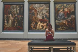
Creating a balanced composition in art is akin to orchestrating a symphony where each instrument contributes to a harmonious whole. Artists strive to achieve this balance by carefully arranging elements such as color, texture, shape, and form. These elements, when skillfully manipulated, can transform a simple canvas into a masterpiece that captures attention and evokes emotion. Art, like any other form of expression, is deeply personal yet universally communicative. The journey to mastering balance in composition involves understanding the dynamics of visual weight, symmetry, asymmetry, scale, proportion, color, and even the space that’s not immediately obvious—the negative space.
Understanding Visual Weight and Balance
Visual weight refers to the perceived importance or heaviness of an element within a composition. It’s not about the physical weight but rather how a viewer’s eye is drawn to different parts of the artwork. To illustrate, imagine a painting with a large, dark shape on one side and a smaller, lighter shape on the other. The darker shape will naturally attract more attention due to its visual weight.
Balancing Visual Weight
To achieve balance, artists can strategically place heavier elements alongside lighter ones. For instance, a bold red apple might be offset by a cluster of pale yellow daisies. This juxtaposition creates equilibrium and keeps the viewer’s gaze moving across the entire artwork.
Practical Tip: When composing your artwork, consider using a grid to map out where your elements will sit. This can help you visualize and adjust the balance before you commit to your final composition. Moreover, experimenting with thumbnail sketches can be an effective way to test out various arrangements quickly.
Personal Insight: In my experience, I often find that stepping back from a piece and viewing it from a distance can provide a fresh perspective on visual weight distribution. Sometimes, simply altering a single element can make a significant difference in achieving harmony.
Utilizing Symmetry and Asymmetry
Symmetry and asymmetry are two powerful tools in an artist’s toolkit. Symmetry involves creating a mirror image or a balanced arrangement on either side of a central axis. This technique often instills a sense of stability and order.
Exploring Symmetry
Consider classic examples like Leonardo da Vinci’s “Vitruvian Man,” which uses symmetry to explore human proportions and harmony. This technique can be particularly effective in works intended to convey calmness and formality. Symmetry can also be found in nature, inspiring artists to mimic its soothing effects in their compositions.
Real Example: Many artists, especially those working in architectural designs, utilize symmetry to evoke a sense of grandeur and timelessness. Think of the Taj Mahal, where symmetry is critical to its majestic appearance.
Delving into Asymmetry
On the flip side, asymmetry involves distributing visual elements unevenly to achieve balance through contrast. This approach can infuse a composition with life and movement, making it more engaging. Artists like Pablo Picasso often used asymmetry to challenge traditional perceptions and create dynamic, innovative pieces.
Case Study: In Picasso’s “Les Demoiselles d’Avignon,” the asymmetrical arrangement of figures creates tension and intrigue, drawing viewers into the work’s complex narrative. The deliberate imbalance prompts a deeper engagement as the viewer’s eyes dance across the canvas.
Practical Exercise: Try creating a series of small compositions where you intentionally disrupt symmetry. Notice how these changes impact the mood and energy of your work. This can be a powerful exercise in understanding the emotional implications of balance.
Playing with Scale and Proportion
Scale and proportion are fundamental in establishing balance within a composition. Varying the sizes of elements can create interest and depth, guiding the viewer’s eye across the artwork.
Mastering Scale
Consider a landscape painting where mountains loom large in the background while a tiny hiker traverses the foreground. This contrast in scale not only emphasizes the grandeur of the mountains but also creates a sense of space and perspective.
Professional Insight: When working with scale, be mindful of the relationship between elements. Too much disparity can disrupt balance, while subtle variations can enhance it. For instance, in portrait art, enlarging the eyes slightly more than natural can add emphasis and draw attention to the subject’s expression.
Common Mistake: Overemphasizing certain elements can lead to an unintentional imbalance. Always step back and assess whether the scale serves the overall narrative of the piece.
Color Harmonies and Contrast
Color is a potent tool for creating balance. Artists often employ color schemes such as complementary, analogous, or triadic to evoke specific emotions and achieve harmony.
Exploiting Color Harmonies
Complementary colors, like blue and orange, are opposite on the color wheel and can create a vibrant, balanced effect when used together. Analogous colors, sitting next to each other, can create a more seamless, harmonious look. Understanding the emotional and psychological impact of color is crucial in achieving the desired balance.
Real-Life Application: Interior designers frequently use analogous color schemes to create a cohesive and peaceful space. Applying these principles to your artwork can similarly produce a sense of unity.
Creating Contrast
Contrast can also be a powerful way to draw attention and establish balance. Using colors that pop against each other can highlight important elements in a composition.
Example: In Van Gogh’s “Starry Night,” the swirling blues and yellows contrast yet harmonize, creating a dynamic and balanced scene that captures the viewer’s imagination. The vibrant contrasts keep the eye moving and engaged, portraying the emotional turbulence Van Gogh experienced.
Practical Tip: Experiment with color studies to see how different combinations affect the mood and balance of your work. Use swatches and small test pieces to explore various palettes without committing to a full composition.
Embracing Negative Space
Negative space, or the empty areas surrounding and between subjects, plays a crucial role in composition. It provides breathing room and can emphasize the positive elements within a piece.
Leveraging Negative Space
Artists such as M.C. Escher used negative space to create intriguing optical illusions, where the background and foreground seem to interchange roles. This technique can guide the viewer’s eye and highlight focal points.
Pro Tip: When planning your composition, consciously decide what to leave out. The absence of detail can be just as powerful as its presence, allowing the main subjects to shine. Consider the work of minimalist artists who utilize negative space to evoke emotion and focus.
Case Study: In the realm of graphic design, logos often employ negative space to convey clever hidden messages or enhance brand identity. The FedEx logo, for example, uses the negative space between the “E” and “x” to create an arrow, symbolizing speed and direction.
Additional Techniques for Balanced Composition
Rhythm and Repetition
Rhythm in art refers to the repetition of elements to create movement and flow. Think of it like the beat in music. Repetition can bring a sense of unity and cohesiveness to a composition.
Example: Claude Monet’s “Water Lilies” series exemplifies rhythm through the recurring shapes and colors of the lilies, creating a serene, balanced visual experience. The gentle repetition mimics the natural ebb and flow of water, inviting viewers to linger and reflect.
Exercise: Try incorporating rhythm in your work by repeating shapes, lines, or colors. Notice how this technique can transform a static piece into one that feels alive and connected.
Leading Lines and Focal Points
Leading lines are paths within a composition that guide the viewer’s eye. These lines can direct attention to focal points, creating a structured, balanced layout.
Case Study: In Ansel Adams’s photography, leading lines are used to draw the viewer into the landscape, often leading to a focal point that anchors the composition. The natural contours of the land or man-made structures often serve as these guiding lines.
Practical Tip: When setting up a composition, intentionally place lines that lead toward your focal point. This can be as simple as the angle of a shadow or a pathway in a landscape.
Exploring the Golden Ratio
The golden ratio, approximately 1.618, is a mathematical proportion that’s often found in nature and has been used by artists and architects throughout history to create aesthetically pleasing compositions.
Applying the Golden Ratio
The ancient Greeks used the golden ratio in their architecture, and it’s also seen in the works of artists like Salvador Dalí. By using this ratio to structure your composition, you can create a sense of harmony that feels naturally balanced to the human eye.
Practical Application: Divide your canvas using the golden ratio to determine the placement of key elements. This approach can guide the viewer’s eye in a way that feels both intentional and organic.
Common Mistakes and How to Avoid Them
- Overcrowding: Packing too many elements can overwhelm the viewer. Instead, focus on simplicity and clarity. Use editing as a tool—sometimes less truly is more.
- Ignoring Proportion: Disregarding the relationship between elements can disrupt balance. Always consider how elements relate in size and scale. Sketching preliminary studies can help visualize proportions before committing to your final piece.
- Neglecting Color Balance: Overuse of vibrant colors can create chaos. Balance bold colors with neutrals to maintain harmony. Consider the emotional impact of colors and how they work together to support the composition’s narrative.
- Forgetting About the Viewer’s Journey: The composition should guide the viewer’s eye through the artwork. Avoid compositions that don’t offer a clear path or focal point, as these can leave the viewer feeling lost or disengaged.
- Overlooking the Power of Texture: Texture can affect visual weight and balance. Incorporating varied textures can add interest and depth, but be mindful of how they interact with other elements.
Encouragement for Your Creative Journey
Creating a balanced composition is both an art and a science. By understanding and applying these principles, artists can craft pieces that resonate with viewers and stand the test of time. Whether through symmetry or asymmetry, color or scale, the goal is to create a composition where every element feels just right, contributing to a harmonious whole. Remember, balance is not about perfection but about creating a piece that feels complete and satisfying to both the artist and the audience. Keep experimenting, learning, and most importantly, enjoying the creative journey.
Final Thought: As you continue to explore the world of art, remember that rules are meant to guide, not restrict. Some of the most profound artistic breakthroughs have come from breaking the norms. Use your knowledge of balance as a foundation upon which to build your unique voice and vision.


